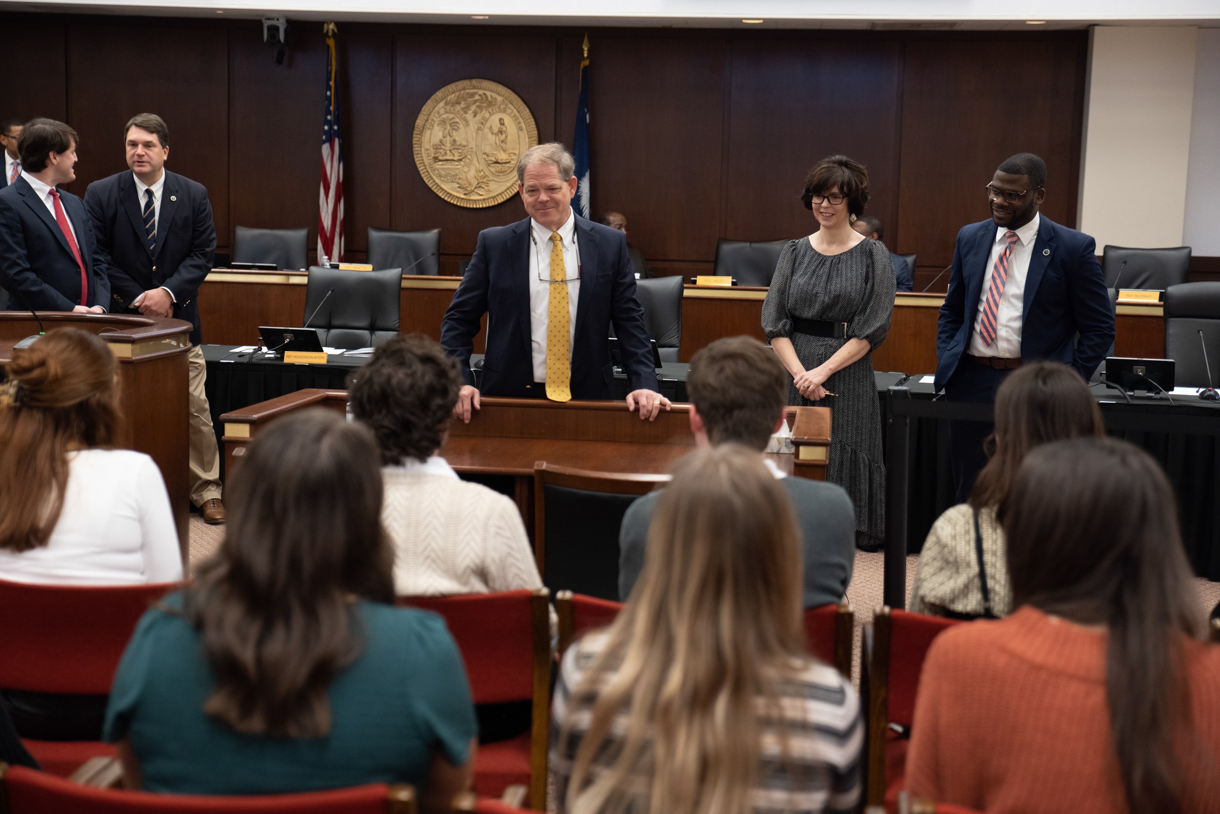
Re-designing a suite of deliverables for the South Carolina House Legislative Oversight Committee.


Objective
My team was in charge of a total redesign of the printed documentation that the committee currently uses to be more accessible to both the general public and the members of the committee, easier to read, and capable of digital integration.
We also had to take great care that our assets aligned with those of the other groups; so establishing brand norms like a type scale, logo, color pallet, and iconography was essential to the success of this project.
Process
The process for this project consisted of an initial interview in which we sat down with the committee’s public relations team and tried to understand what their pain points were as an organization; a visit to truematter UX agency in Columbia; and collaboration with teammates to ensure the delivery of assets that were all consistent and high quality.

Executive Report
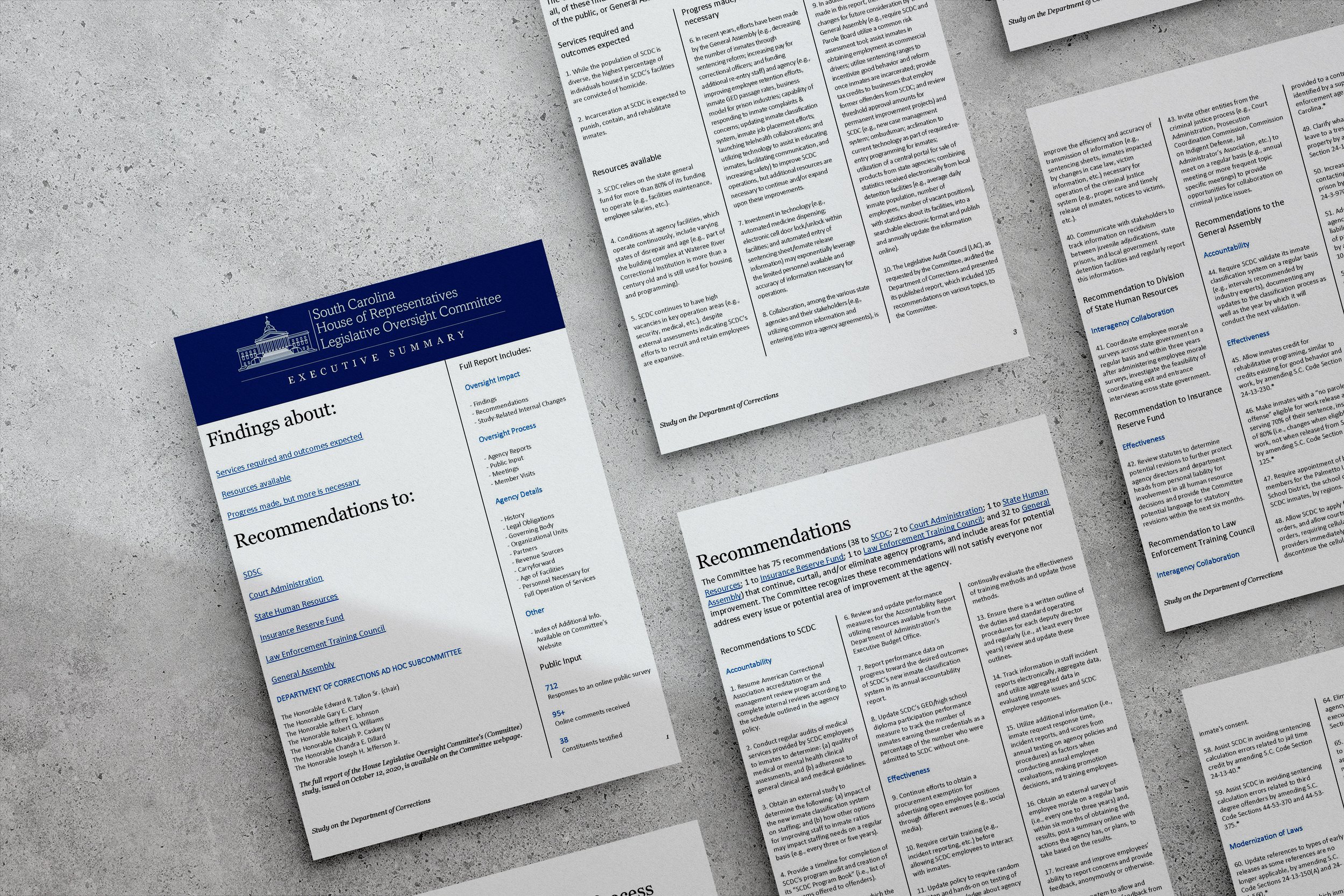
One of the first issues they brought up was that there were a lot of problems holding the viewer's attention with the current design. The solution to this was easy, in my eyes. Their original document had practically no leading and a ridiculous average line length (~18 words per line). To achieve this, I switched the layout of the document from the one-column grid they had previously to a three-column grid. Things like this may seem small to the uninformed, but they are absolutely crucial in designing the flow of the document. I think the before and after speaks for itself!
The second problem that they brought to my attention was the need for this document to be read on screens, as well as in print. Designing for both of these mediums at the same time was an interesting challenge. I decided to add interactive hyperlinks, called "bookmarks" in Word. This allows for readers to quickly jump around the document during discussion on key points, but also doesn't change the integrity of the printed document. Everything underlined in blue is clickable, and they are all over the place in the document.
In addition to these two major problems brought up by the team, there were a couple of things that I noticed that could also be fixed pretty easily. The visual hierarchy of the original document was practically nonexistent. Simply creating a style guide and set of header, sub-header, and body fonts did wonders to guide the reader's eye. There were also issues regarding scanability and clarity, but switching to the columnar layout helped the document become much more digestible and easier to navigate. And, after implementing these changes, the document length was cut from 10 pages to 7 — saving 30% on printing and paper costs (with a little bit of extrapolation).
Before
After
Final Deliverables
Printed Matter Team
Jane Armstrong
Sarah Hoffman
Liam Owen
Mitchell Zarkis
Collaborators
Website Team
Jackson Gaulke
Hannah McDonald
Katie Paige-Moore
Sydney Strause
Newsletter Team
Fabiana Echiverri
Daniel Neath
Semaj Shaull
Jadyn Velpula


